The right place to solve a design problem isn't every feature — it's once, at the system level.
Initiated the build of the shared design foundation that unified Quest's product suite — reducing duplicated effort, eliminating inconsistency, and making every subsequent feature faster to design and ship.
- Role
- Senior Product Designer
- Outcome
- Implementation and reconfiguration that would have required touching every component took less than a couple hours once the token system was in place; developers reported more time on building problems, less on component decisions
Quest’s product suite looked and felt like it had been built by four different companies — because, functionally, each build was siloed. Each team had its own component patterns, color applications, and interaction conventions that served different types of user bases. An audit of the existing products before I proposed anything found: Over 11 unique button styles. 14 form input variants. 6 modal and flyout patterns. 43+ color values in production — against an intended reduced palette of less than 16.
This wasn’t negligence. It’s what parallel teams produce without shared ground. Every feature built on that foundation made the next one harder.
The system
A design system fails if it isn’t adopted. Adoption depends on the system being easier to use than not using it — which means components have to be genuinely better than what a team would build independently, and documentation has to answer real questions.
the token layer is the grammar; the components are the sentences
Our design team built the system in three layers. A semantic token system first — colors, spacing, typography, and radius values named by role (--ink, --surface, --accent) rather than value. Then a scoped component library using Figma and Storybook covering the twenty components that appeared in every product. Then documentation was treated as a first-class deliverable - a part of the process - not an afterthought.
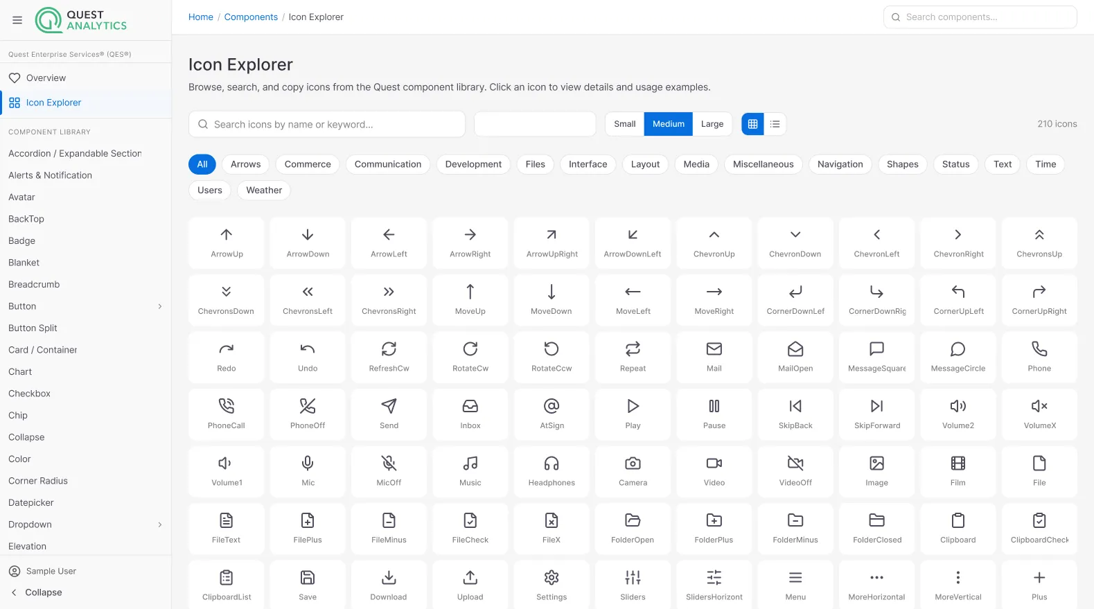
The decisions
Role over values. Starting with the idea of tokens meant find themes that could be handled at one layer without touching individual components. It also forced a clarifying question for every design decision: is this a role, or is this a value? That distinction, made early, paid dividends for our organization.
Scope discipline. We resisted building everything at once. Version one covered the basic and most persistent components that appeared across every product. Everything else was documented as “use with judgment” until usage patterns justified standardization. A system that tries to cover every edge case immediately becomes unmaintainable. The constraint was the point.
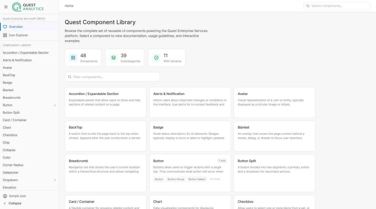
Variant discipline. Every component had a defined set of variants and no more. The button had primary, secondary, and disabled states. It did not have a “special case” state for every team’s preference. This required negotiation — teams had grown attached to their local solutions, and avoided reworking what was already done. The system holding the line here was what made it a system. Accommodate every edge case and you’ve built something that imposes no consistency at all.
The documentation for each component included a “what it’s not for” section - a do and don’t with guidance of when. When teams understood the boundaries, they made better decisions about when to use a component and when to flag a genuine gap rather than forcing a misfit.
A lightweight contribution process kept it alive: any team could propose an addition or modification, proposals went through a review window with our team, and approved changes shipped either on a regular cadence or with a reusable component built into a new feature or enhancement. Low friction by design — the goal was a living system, not a gated repository.
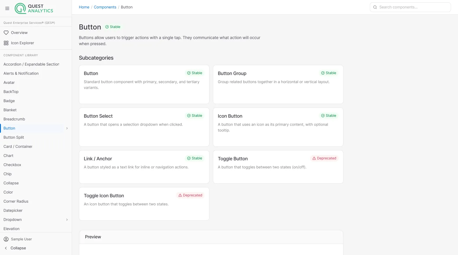
What changed
- Cross-product visual consistency measurably improved within two quarters of consistent adoption
- Designers reported spending less time on foundational decisions and more on the actual critical experience and workflow problems their features needed to solve
- Development teams would take minutes to make changes that cascaded across the suite of products versus days to customize individual components - exchanging friction for freedom to build on problems.
Reflection
The work that compounds most in product design is rarely the work that ships. The token system, the contribution process, the “what it’s not for” documentation — none of it was visible to users. All of it determined whether the products that followed would be coherent or not. The one thing I underinvested in: motion. Transitions and timing were either left to individual teams, removed altogether or implemented on a case by case basis, with some level of unofficial consistency. Leaving it to teams reproduced the same fragmentation in interaction feel that the visual system had solved for static states. A motion token layer — durations, easing curves, standard animation types — should have been part of version one.
Have a question about this project?
Ask Stefan →