When the data can't be trusted, neither can the decision
Seven upstream sources, each with conflicting data and its own quality issues. The company's instinct was to hide the conflicts. My PM and I argued the opposite — that hiding bad data was what was eroding trust, not the data itself. This project built the proof.
- Role
- Senior Product Designer
- Outcome
- Unique visitors to the provider profile grew 786% in the six months following launch — 57 to 505 unique visitors, across 93 unique accounts. The new Provider Profile became the primary access path into provider data, with click volume growing from 807 to 9,959. Data integrity indicators — the feature the product team initially resisted — became something users specifically cited in satisfaction surveys as solving a trust problem the product hadn't previously addressed.
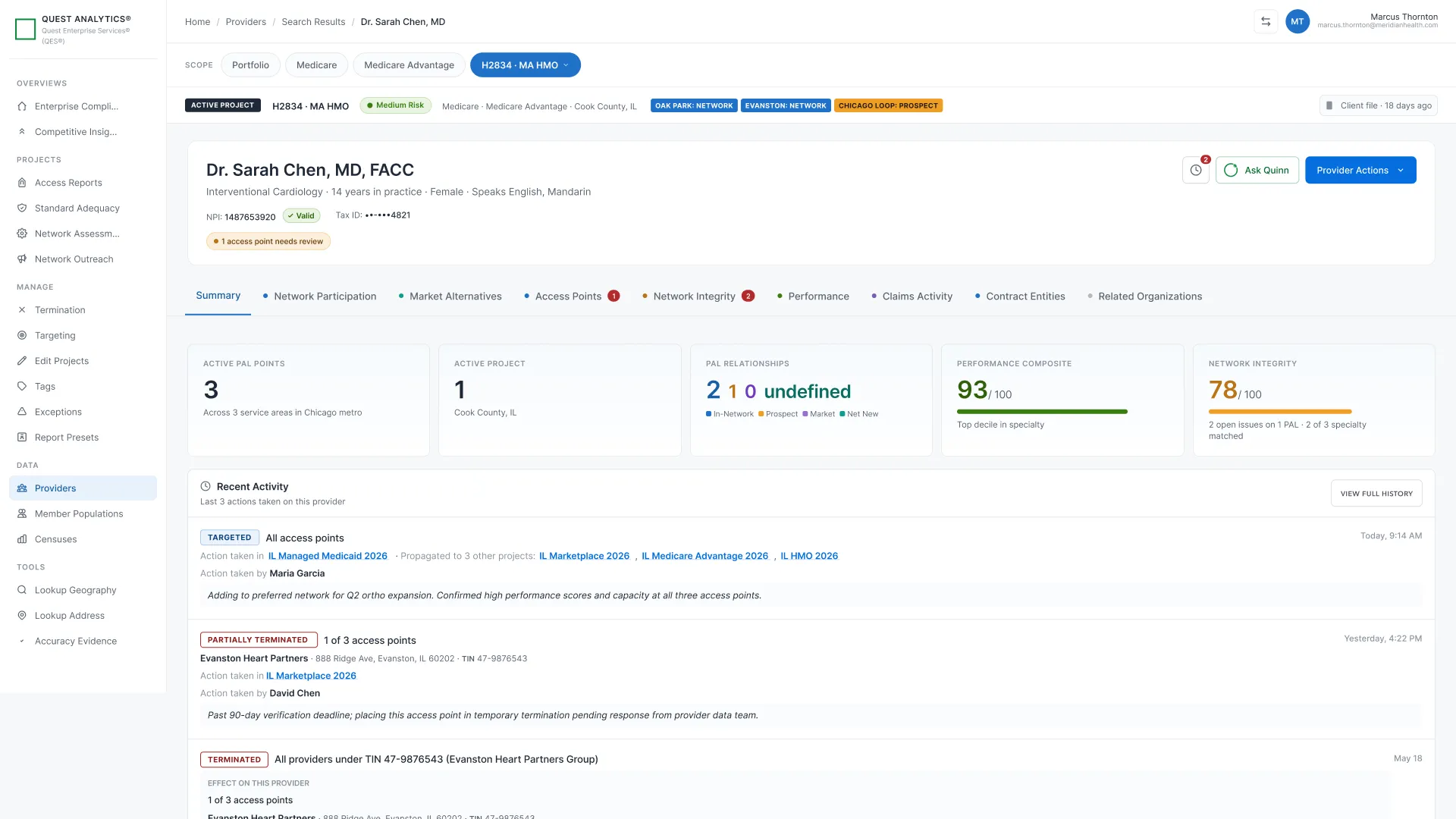
A provider profile sounds simple — show everything we know about a doctor or entity on one page. In practice, “everything we know” came from seven upstream data sources, each with its own update cadence, quality issues, and organizational owner. And the company’s standing approach to those quality issues was to hide them.
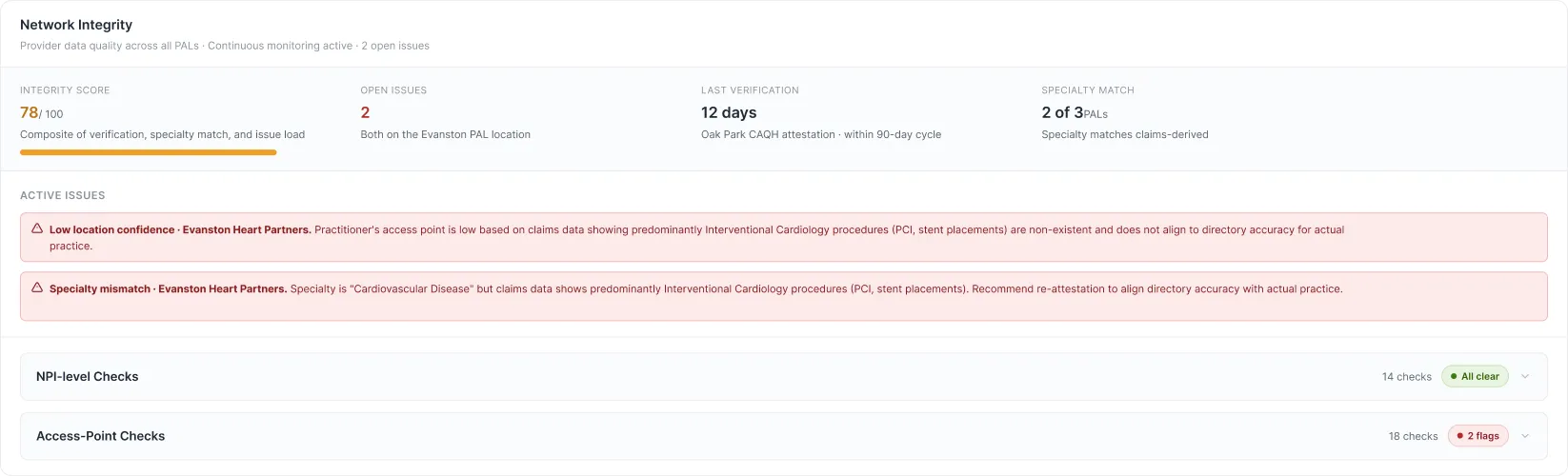
The reasoning made sense on the surface: surfacing errors might undermine confidence in the product. But analysts already knew the data had problems — 52% of provider directory entries contain at least one inaccuracy. (CMS Provider Directory Review, 2018) What they didn’t have was context. They couldn’t tell which data point to trust, which source had flagged an issue, or why a conflict existed. Hiding the problem didn’t build trust. It just made the uncertainty invisible — and therefore unresolvable.
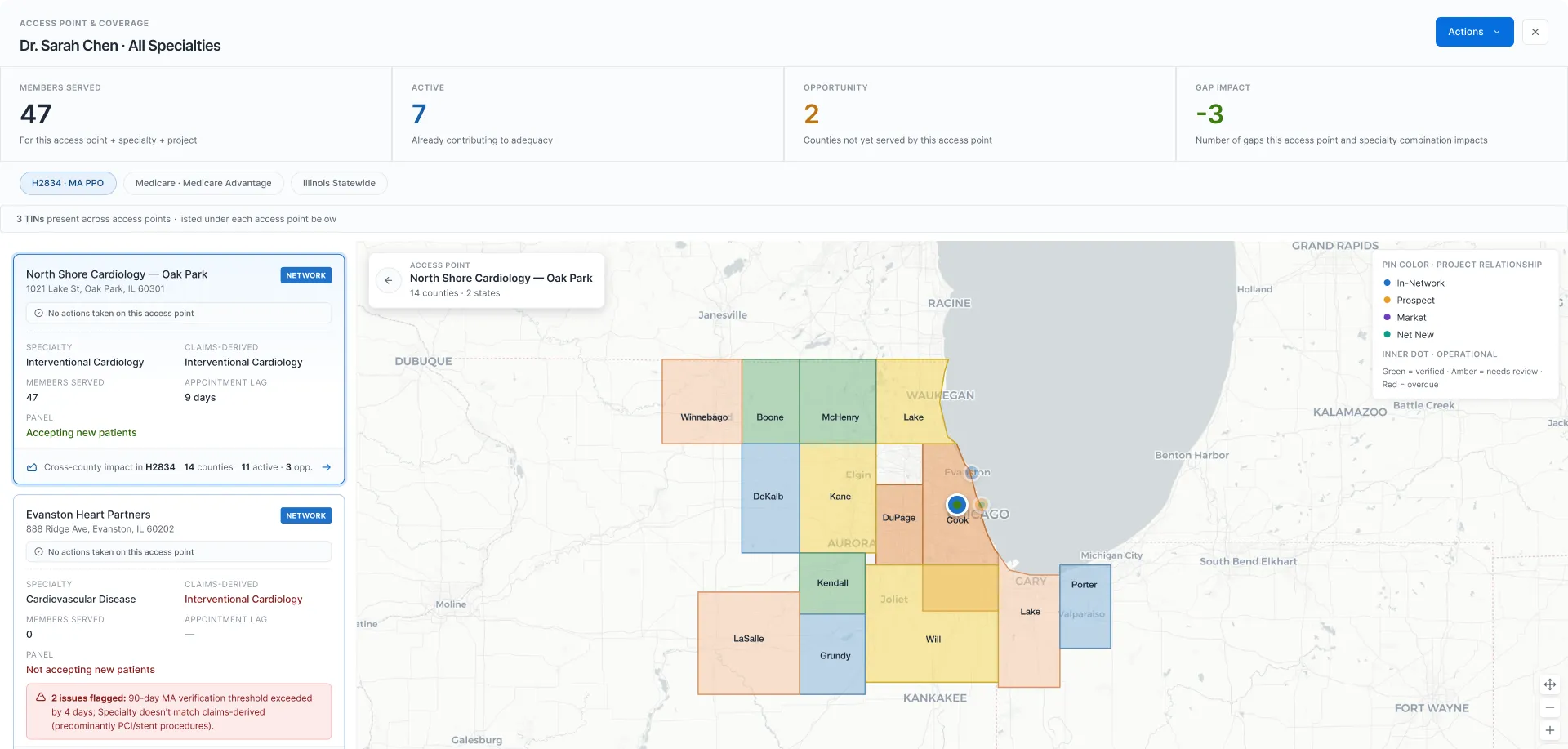
The design challenge wasn’t layout. It was making data legible at the level where a contracting decision actually gets made: a specific provider, at a specific location, within the context of what they do and who they serve.
The system
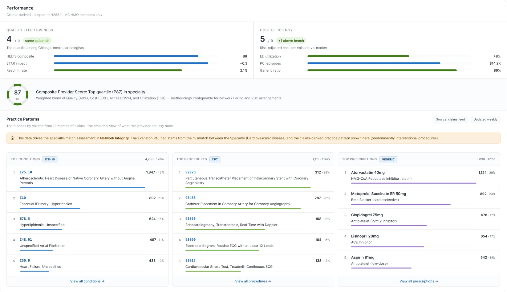
Two users came to the same page with fundamentally different needs. An analyst needed facts: is this provider credentialed, contracted, eligible? A director needed a narrative: how is this provider performing, what’s their adequacy contribution, what action is recommended?
the analyst needs facts; the director needs a narrative
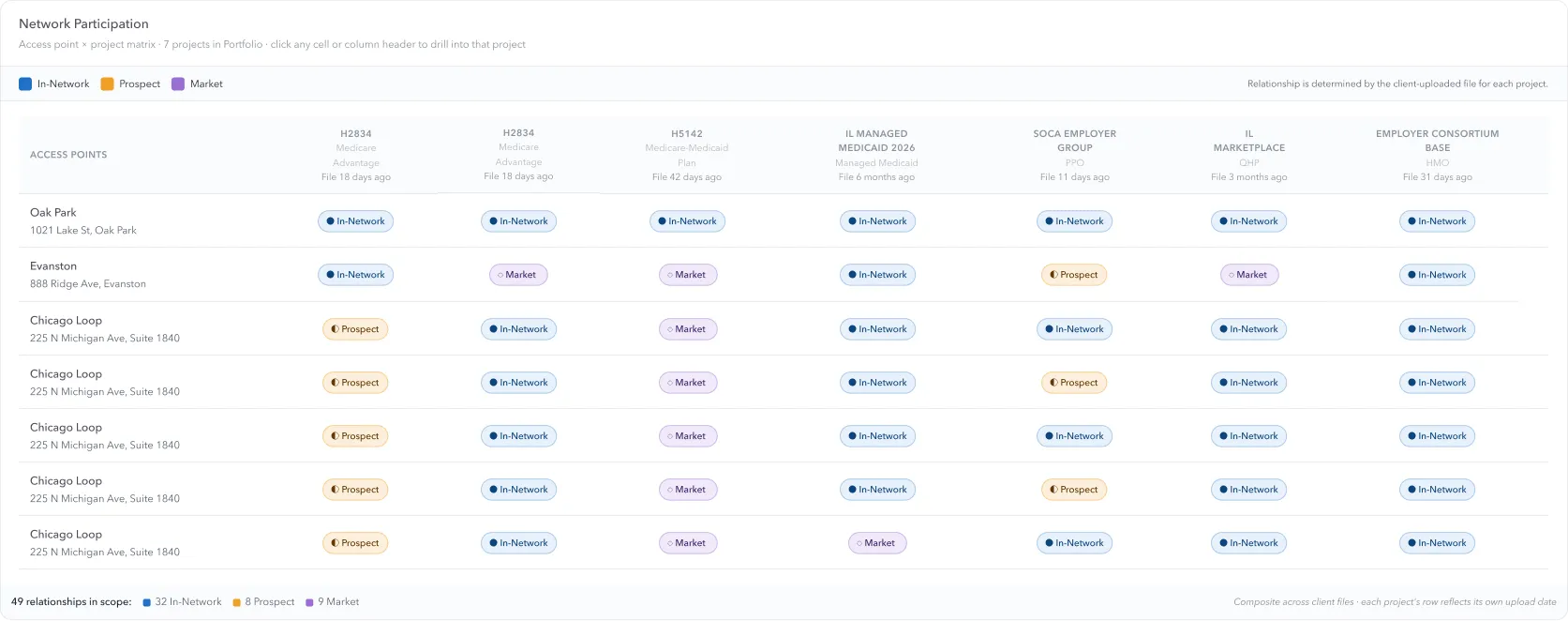
That framing was clear early. What wasn’t clear was how to build it — because the data itself didn’t arrive in a clean, unified form. Clients purchased different packages, each surfacing different data buckets. The profile had to show a coherent picture of a provider’s impact while respecting what each client had access to, and remaining flexible enough to scale as packages changed.
I designed the profile as a layered page. A shared top section — provider identity, primary specialty, compliance status — answered “is this the right provider?” quickly. Below that, the page forked by role and by data access. Analysts saw a view organized by access point and product package, with data provenance visible alongside every data point. Directors saw a summary-first view: performance breakdown, adequacy contribution — with the ability to drill into the same underlying data from a strategic entry point rather than an operational one.
The decisions
Data provenance as a first-class design element. The pushback on this decision came from multiple directions. The historical approach across client-facing teams was to suppress data errors to drive cleaner regulatory submissions — surfacing problems felt like admitting the product was broken. There was also a genuine technical limitation: our systems couldn’t always verify against third-party sources, so some conflicts had no clean resolution.
My PM and I argued that hiding conflicts wasn’t protecting users — it was leaving them without the context they needed to make a judgment call. An analyst who sees a flagged discrepancy and understands why it’s flagged can decide how to proceed. An analyst who sees clean-looking data that’s actually wrong makes a confident mistake. We pushed to surface the conflict with context — source, nature of the discrepancy, and what it meant for downstream decisions — and leave the adjudication to the human. The product team resisted. Users confirmed it was the right call.
Segmentation structure: three iterations. The first version organized by data source — the natural grouping from an engineering perspective, and the wrong one for users.
The second organized by task: credentialing, contracting, evaluation. Better, but it still mapped to internal process categories rather than the questions analysts actually arrived with.
The third — the one we shipped — organized around the question an analyst was trying to answer — segments like “Is this provider qualified?”, “What’s the business relationship?”, “How are they performing?” — even if the tabs themselves carried content labels like Network Integrity, Performance, and Access Points.
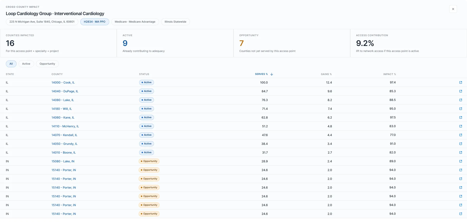
The shift mattered because it also surfaced a deeper infrastructure problem: how we pulled data, from which backend source, and how client package configurations determined what was visible to whom. Organizing by question forced us to resolve those data architecture questions explicitly rather than patch around them. Analysts didn’t come to the profile wondering what the credentialing system had to say. They came wondering whether this provider would serve the purpose they were trying to fill.
Presence over blocking on data conflicts. When conflicting values surfaced from two source systems, the instinct was to resolve or hide the conflict at the data layer. I pushed to show the error with a warning instead. The system’s job wasn’t to adjudicate disputed data — it was to surface the dispute so a human could. Automating that judgment would have produced confident-looking incorrect answers.
What changed
- Analysts gained a single view of a provider’s impact — across access points, network participation, performance, integrity, and activity — without navigating between tools or reconstructing context from separate screens
- Unique visitors to the provider profile grew 786% in the six months following launch — from 57 to 505 unique visitors across 93 unique accounts — based on Pendo usage data. Click volume grew from 807 to 9,959, with the Provider Profile becoming the primary access path into provider data across the platform
- Data integrity indicators — the feature the product team initially resisted — became something users specifically cited in satisfaction surveys as solving a trust problem the product hadn’t previously addressed
- The segment structure — organized around analyst questions rather than data sources or internal process categories — arrived at through three iterations, became the model for how subsequent profile features were organized
Reflection
The hardest design problems in enterprise tools aren’t about interaction patterns — they’re about information integrity. Users of complex systems are sophisticated enough to handle messy data. What they can’t handle is uncertainty about whether the data is messy. Making the system’s limitations visible isn’t an admission of failure. It’s the design.
The harder organizational lesson was about what hiding problems actually signals to users. It signals that the system doesn’t trust them to handle the truth. In healthcare enterprise software, where the decisions are high-stakes and the users are experts, that’s exactly the wrong message. Transparency isn’t a design choice you make when the data is clean. It’s the design choice that makes the data trustworthy.
The work
The unified record
Relationships across every network
Geographic reach and adequacy impact
The adequacy math behind each location
Data quality surfaced, not hidden
The director’s lens
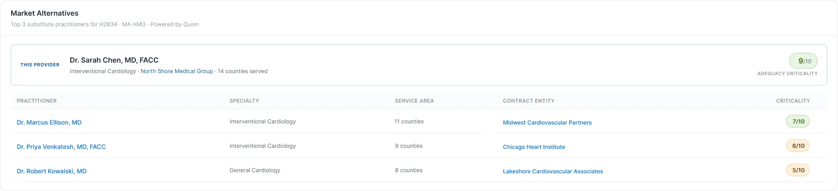
Competitive context at the point of decision
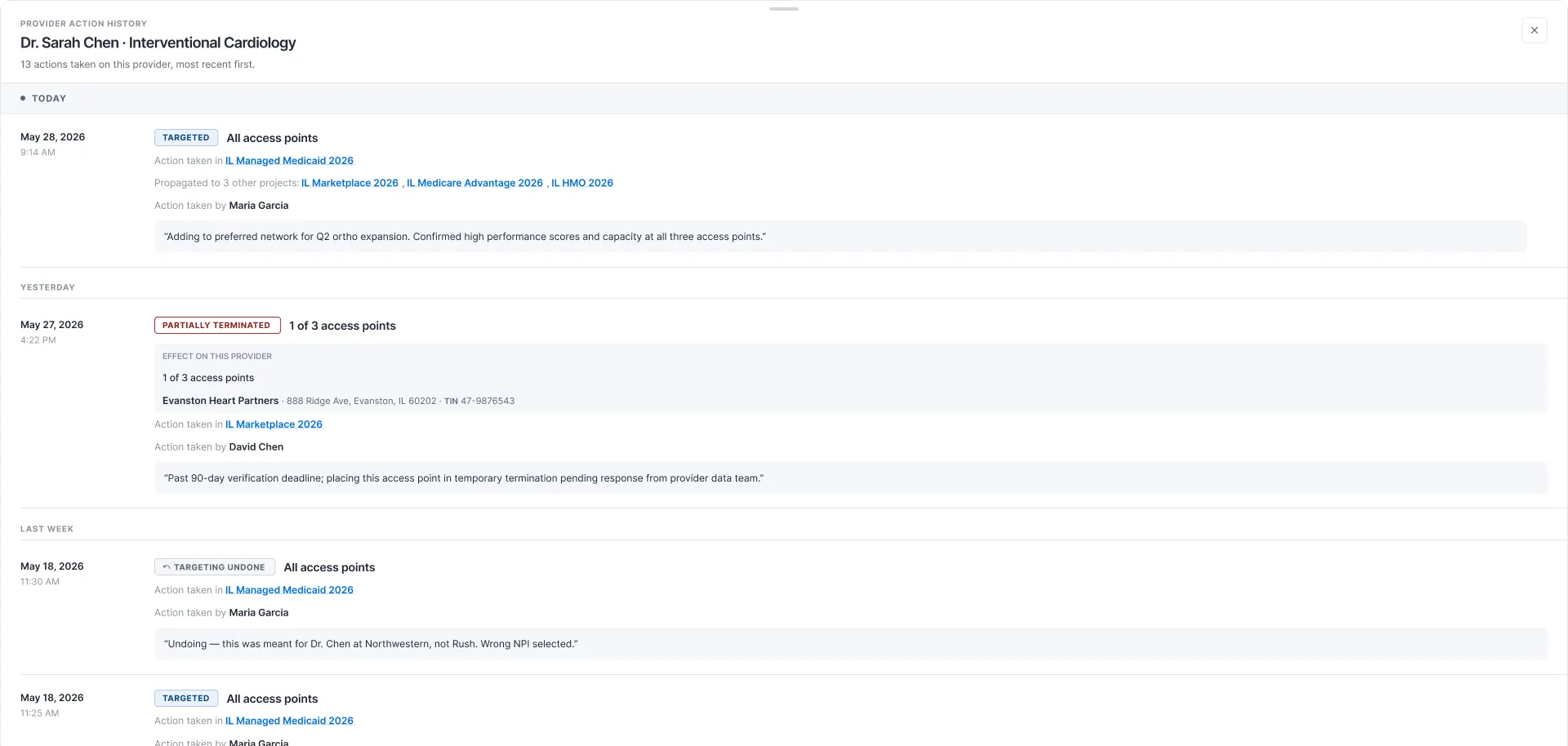
The action thread tied to the record
Have a question about this project?
Ask Stefan →